Exclusive Interview: James Charles

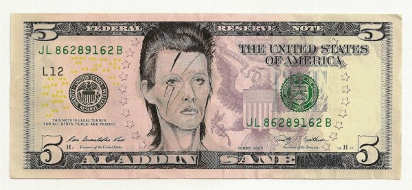
Artist James Charles confronts us with satirical humor by seamlessly employing his deft illusionism on actual U.S. currency. This results in a playful commentary on American culture by inverting our beloved icons of monetary value. He discusses the visual nuances in money, as well as the new direction of his current work. His solo show ‘333 Conspiracy’ opens on July 14th, 7-11pm, and will run through August 4th at the Shooting Gallery.
RSVP here
View more after the jump.
What is seductive about using money as art from the viewer’s perspective?
From the viewers’ perspective, probably the fact that it is (or was) money could be an attraction. We see paper money almost every day. We’ve been using it for generations. It has an iconic look to it in and of itself that hardly ever changes. I think that when it’s altered in unusual ways and framed as art, it’s a little bit startling. A curveball for the eyes, if you will.
You successfully fool the viewer by working a humorous message into what initially appears to be a legitimate piece of currency. What illusionistic techniques do you use in order to achieve such a smooth integration of your art with the bill?
When approaching a portrait I try to use and keep as much of the presidents’ faces as I can. I like to mix things together so that you can still see lots of the original printed marks and features of the bill fused together with the new portrait. I consider the ones that still have a lot of presidential face showing through to be the truly successful ones. Especially if it’s a drastic transformation. The Frida portrait is a good example.
Which bill is the most challenging to work with? And which one of our forefathers has the most malleable features?
Without a doubt, it’s the One. Of all the bills, Washington has the smallest portrait. That factor alone automatically makes it a lot harder to work with. I hardly ever work with single Ones just because of that. My eyeballs are already fried enough. After that, the Ten is tough because there’s not a lot of printed detail on Hamilton’s face to work with. However, I do like that Hamilton has effeminate features and is easily transformed into a woman. Then the Twenty. Without a doubt, Abe has the most malleable features of all the presidents, and is my favorite to work with. I do more work with Fives than any other denomination.
Do you think people are purely drawn to the icons in your bills, or more to the humor employed with them as the butt of a joke?
I think (or hope) both. Although I approach these pieces humorously, I’m pretty serious about portraiture and the labor intensiveness that I put into each piece. More often than not, it’s a lot easier to create a realistic portrait from scratch, than to alter a pre-existing one, mold it into a good likeness, and then try to somewhat match the style of the US treasury. All in all, I hope that people like both the portrait work, and the humor.
In your new exhibition, you’ve expanded past the central portraiture to using the whole bill, even fusing several bills together. In your earlier pieces, the money was initially identifiable before the art, but in some of your recent work, the art is visible before the money. This seems to be using the money in a different way: how has this shift affected the role of money in your art?
Well, these newer pieces are more about my images and less about the importance of money or manipulating portraits. It’s more about just using it as paper. They are beginning to stray away from the portraiture project and are influenced by a lot of the other art and imagery that I’ve been experimenting with for the past few years. Even though my images dominate these pieces, the small details of the bills still bleed through into these compositions. I wanted to make some larger pieces; it just seemed like a natural progression to work this way. Plus, I just like the way that paper currency accepts different media; it’s a blast to work on. Good ol’ American rag paper.75% cotton, 25% linen. Gotta love it….or leave it.


